Showing posts with label analogous color scheme. Show all posts

Monday, February 10, 2025

Analogous Painted Box Tactile Sculpture


What can you do with an old coffee table top and a bunch of tiny boxes handed to you in a garbage bag? Make a relief sculpture for a color theory lesson of course!

For this project, students painted the boxes on one side of the color wheel, ranging from pink to green. Students mixed yellow with the pink and yellow with some blue so that most of the colors were warm and cheerful.
Students needed vision to mix the colors but didn't need any vision to feel whether or not their box was covered with paint. We all worked together to finish 135 boxes in 9 rows of 15. The coffee table had a light spray paint coverage with blacks so that some of the old scratches were covered.
Then we used masking tape to make rows and light up the squares.

It was nothing short of a miracle that the width of the tape on each age, and a tape widths between each row and column worked out to fill the space exactly.  It was a real win for the power of eye-balling and guess work. We were just guessing how many boxes we'd need. It took two people to light up the ends of the tape on either side of a box. We didn't use rulers to measure, just the width of a box.

I glued the bottoms down with hot glue and now we have a tactile sculpture that we can use to discuss things like: rectilinear shapes, crystalographic balance, analogous color schemes, and high intensity. 

Friday, January 31, 2025

Analogous Watercolor Assignment


For a quick and easy color theory project, I had my students choose three neighboring colors on the color wheel to make an analogous watercolor painting. Students began by using masking/painter's tape to break up the picture plane into small, medium, and large, shapes. I like it when the strips of paint go off the edges of the paper, but smaller pieces can work too, as long as there is overlap of tape.

blind student uses fingers to navigate what parts of the paper still need painted.


blind student adding value to tape edges
Then the students wet their entire piece of paper with by brushing or spraying water on their watercolor paper. Next, they painted one color at one end, and then overlap a second color blending along the way. It could be two secondary, such as a blue at one end and red at another to make a purple in the middle, or they could use a primary in the middle like a blue with a blue-purple on one side and a green-blue on the other. 

That could be the end of the assignment, but I found everyone was able to take their painting to a next level but tracing their tape with a pencil and smudging it with their finger or gradually adding lighter value to fade it out, to create a shadow once the tape was pealed off.

By continuing to peal off one piece of tape at a time and shading around the intersections, a sense of layers and depth is created. For those with vision, they could even activate the background by creating even more layers. This was done by laying the tape done again in different positions and retracing/blending, and pealing off. What could have been a five minute exercise in mixing two or three colors to create a color harmony, now becomes an interesting composition using not only color, but line, shape, and value! That's a lot of ground being covered for a two day project.


Monday, September 18, 2023

Analogous Rectilinear Cardboard Relief Art


I love using this cardboard relief assignment to teach how mixing two primaries makes a secondary, and that a primary and a secondary make a tertiary. So with just yellow and blue, you can not only get green, but all the yellow greens and blue greens, and they all look great together. Even children with multiple complex needs can choose which color and a shape to paint. After enough students painted enough pieces of cardboard, organized them from mostly blues at the top to mostly yellows at the bottom. I hot glued them into one giant rectangle of rectangular shapes. This lesson also reinforces the Principle of Design: UNITY, through the repetition of similar colors and shapes. Everyone contributes; everyone wins.


Wednesday, October 21, 2020

Paper Roses


I have been keeping my hands busy during virtual faculty meetings and family movie nights with this simple process for making paper roses. Now it is my student's turn to contribute to what will hopefully a stunning tribute to Helen Keller and those with visual impairments at the upcoming community Festival of Trees. The steps below 


Each paper rose requires four squares of paper (the same color.) A normal 8 1/2 X 11 sheet of paper will get you 4- 4 1/2 squares, or 2- 5 1/2 squares.  Or you can get 6- 6 inch squares from an 12 X 18 piece of construction paper.
 Fold each of your 4 squares in half, diagonally three times to create 8 triangle shapes radiating from the center. Snip the very tip of the folded triangle, and then cut the non-folded edge to be a rounded petal shape. You can cut the petal edge with a simple rounded shape. I like making three bumps with the largest in the center.


Open up these up and you'll have four flower shapes.

Cut one petal out of the first flower, two from the second, three from the third, and the fourth will be cut in half for two four-petal sections. This will leave you with eight parts in the following sizes: 1 petal, 2 petals, 3 petals, 4 petals, 4 petals (again), 5 petals, 6 petals and 7 petals.

Use a pen to curl the petals back.
Start with the largest piece and glue the ends together, overlapping the end two petals.
Then repeat with each section working from largest to smallest, and nesting each one on top of the other, gluing each  of the eight layers. You'll end with the tiny one petal curl in the center.
 It's that simple! I played Marie Osmond's Paper Roses once to inspire me. Enjoy the process and the product. 


Sunday, October 7, 2018

Color Scheme Compositions

Just because the chances of my students ever becoming high end graphic designers are slim, doesn't mean I'm going to stiff them on any of the good stuff.  Types of shapes, strong compositions, color harmonies are all part of the mix in this assignment, that I first gave teaching 2D Design at OSU a couple decades ago. 
I began by asking students to create three compositions.  One had to use only curvilinear shapes, one with only rectilinear shapes, and one had to use both curvilinear and rectilinear shapes.  Each composition had try to break up space by anchoring those shapes to the edges of the paper, and the size of shapes should vary. I wanted large, medium and small shapes in each composition.


 Then we got to color schemes.  One had to be complementary, one triadic, and one analogous. It's not too overwhelming if you take it one step at a time.  Figuring out which composition made sense for which color scheme, and arranging them latter on a 12"X18" piece of paper in a way that distributed the strong colors logically, was an important part of the process.
I hot glued about half the student compositions after they drew them (by using rulers and tracing stencils with pencils or Wiki Stix). Once a student would decide on a color scheme for a composition, and choose which color to do first, I would put little pieces of wiki stick in the shapes for that color, so that they could find the shape and paint independently.  I was thrilled when a new student told me that she loved coming to my class because at her old school they didn't know how to help blind students work as independently as possible. We're just figuring it out together, but if she's happy with the process and I'm happy with the product, then we're doing okay.

Saturday, September 9, 2017

Collaborate Cardboard Relief Sculpture


I recently revisited a project from four years ago, in which I had each student choose a type of shape (rectilinear or curvilinear) and a set of analogous  colors (from yellow to blue, from yellow to red, or from red to blue). After they each painted and arranged their cardboard shapes into a personal relief sculpture, I asked how they would feel about combining them. (They looked so pretty-like a large stained glass window laid out on a large table together).  Eight students agreed, so I got out the hot glue gun and combined them into what now hangs  from the hall ceiling with 2 pieces of wire. It ended up being 6 foot tall, and there are enough individual personal relief sculptures to brighten our classroom as well.

Thursday, September 11, 2014

Shape Month for My Art Class

I dedicated our first month back in school to the design element of SHAPE. I've never taught any of these projects before, but I wanted to find the clearest ways possible to teach the basics of art to students who are visually impaired.

Notan
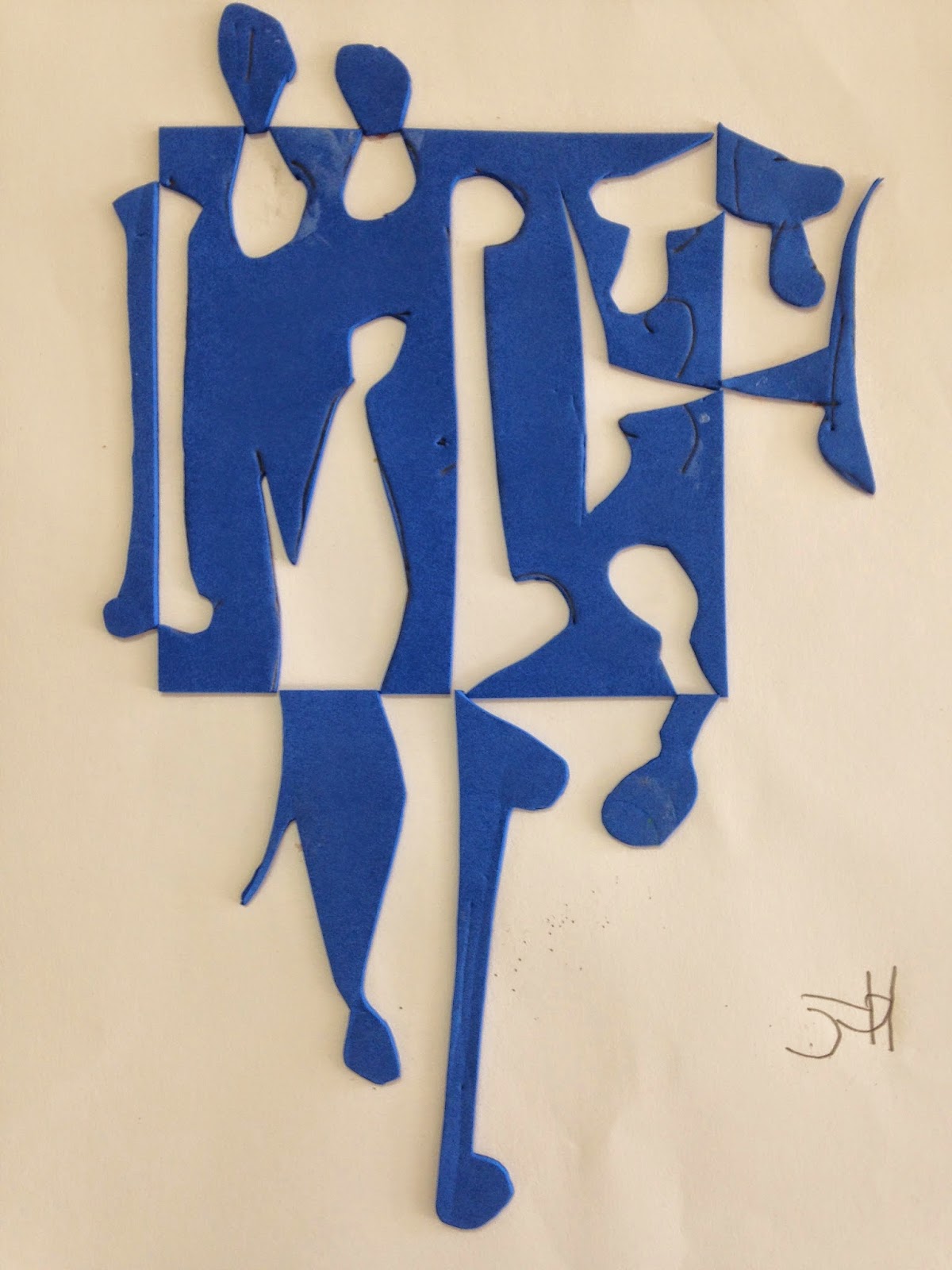
This is my new favorite way to teach the concept of NEGATIVE AND POSITIVE SHAPE. Notan is a Japanese design principle in which dark and light shapes are juxtaposed in an image.  With blind students I found it very helpful to have them use  foam sheets because they could feel the indented lines they drew in creating a shape, and once it was cut out they could put it all back together like a puzzle. After they flipped and glued each piece, they could feel the negative shape (the hole) and the positive shape (the piece they flipped). They each made two images, one symmetrically and one asymmetrically balanced.


Rectilinear Relief Sculptures
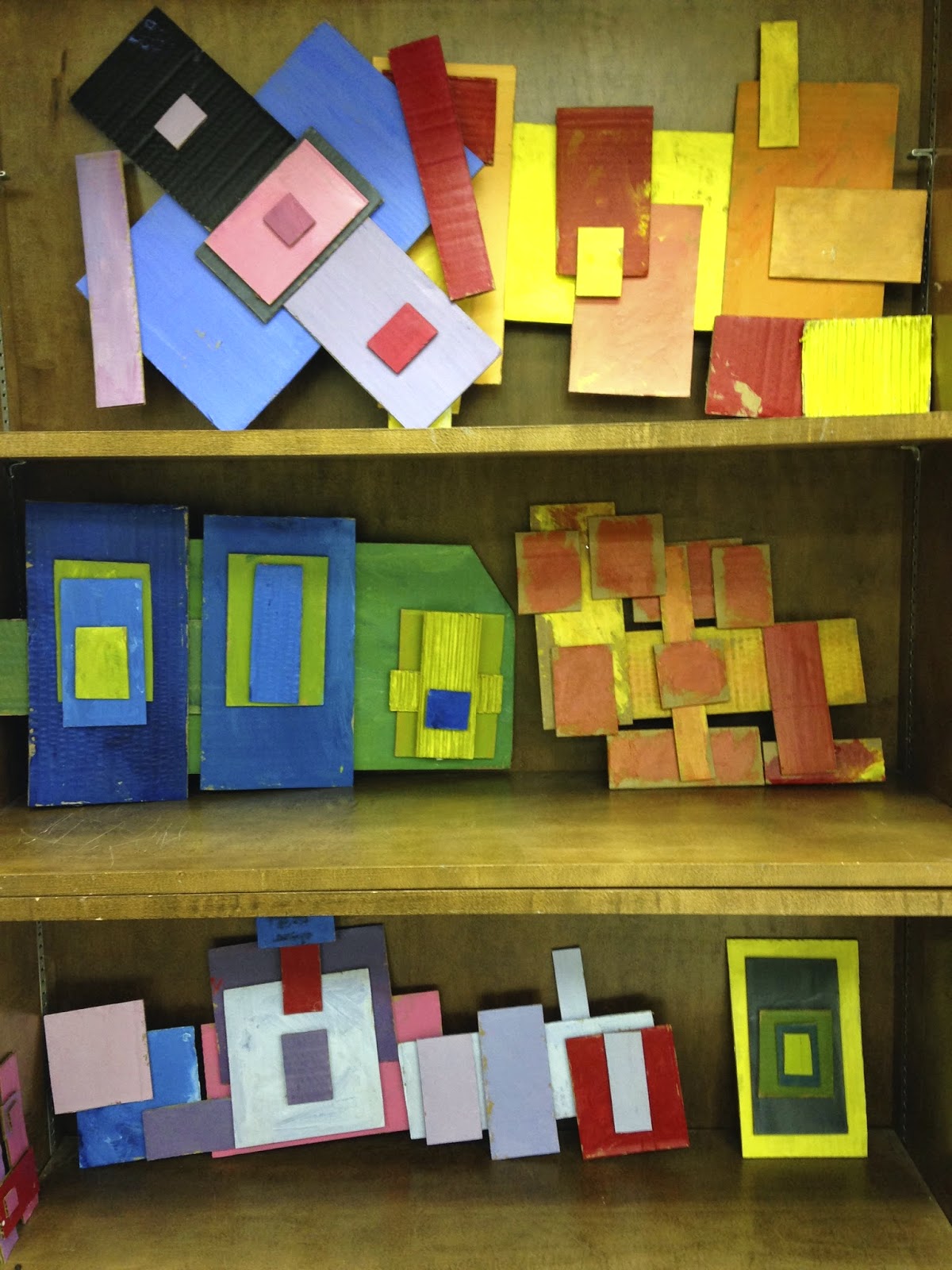
I felt like a little kid at Christmas when all my new classroom supplies rolled in; I just wanted to play with the boxes. I cut these boxes into hundreds of cardboard rectangles which I sorted into piles according to size.  Students gathered a variety of rectangles and picked two primary colors, which they could mix to create an analogous color scheme. They learned about visual unity through color and repetition of RECTILINEAR SHAPES. They arranged the rectangles several times and took digital photos of three different compositions before they chose one for me to hot glue.


Sports Posters
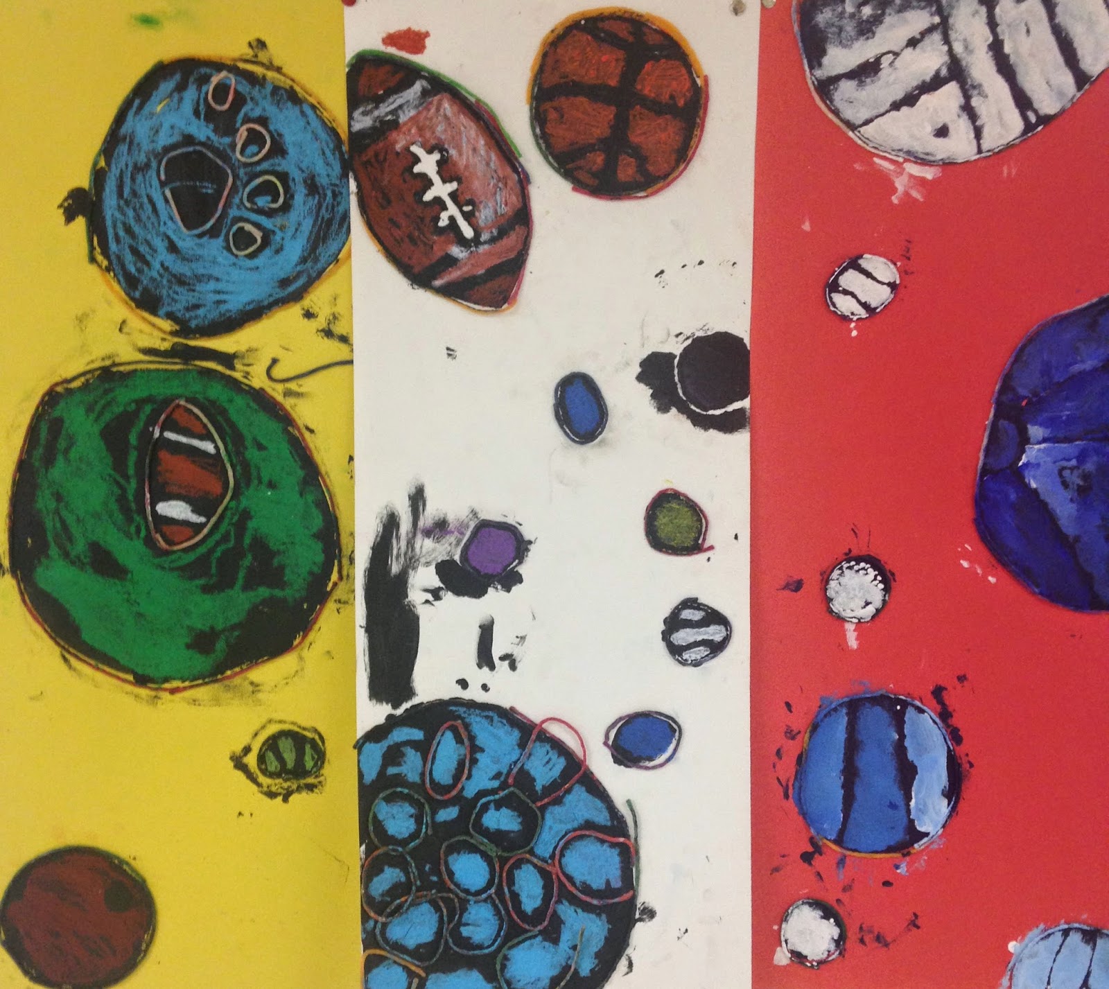
This assignment came about because Coach asked me for help covering his ugly cupboards and I'm all about interdisciplinary assignments.
CURVILINEAR SHAPES are the opposite of the rectangles we worked with the previous week. But we were still building unity through variety of size and unity through repetition of shape. My blind students traced circles with wiki sticks. This provided the tactile boundaries so they would know where to paint. They used black acrylic for the under painting, and then acrylic or oil pastel for the color on top.The fingerprints and smudges come from trying to feel for the dry areas that still needed painting.

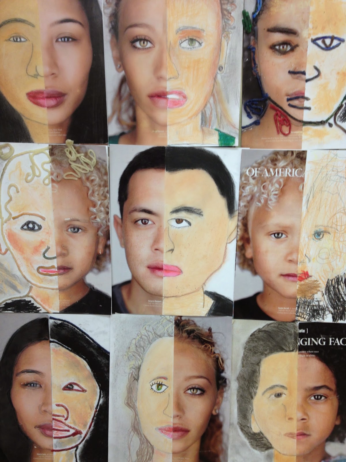
Half Face Drawings
I remember loving this project when I was a kid and have been wanting to try it out with students for a long time. National Geographic had a great article about race in America and I was able to read it and discuss a little genetic science with the students. This assignment was used to teach about NATURALISTIC SHAPE as well as symmetry, proportions of the face, and observational drawing skills like trying to match color. Observational Drawing is hard when you are completely blind, so I traced half the face in hot glue for those students, and after they glued that half face, onto a piece of card stock, they used wiki sticks to create the other half the face. Then they used colored pencils and pastels to color it. Students really enjoyed the process.