Monday, October 29, 2018

Saturation Scale Assignment


 Color has three components: hue (is it blue? red? green?), value (is it light or dark?), and saturation (is it bright or muted?). To help 
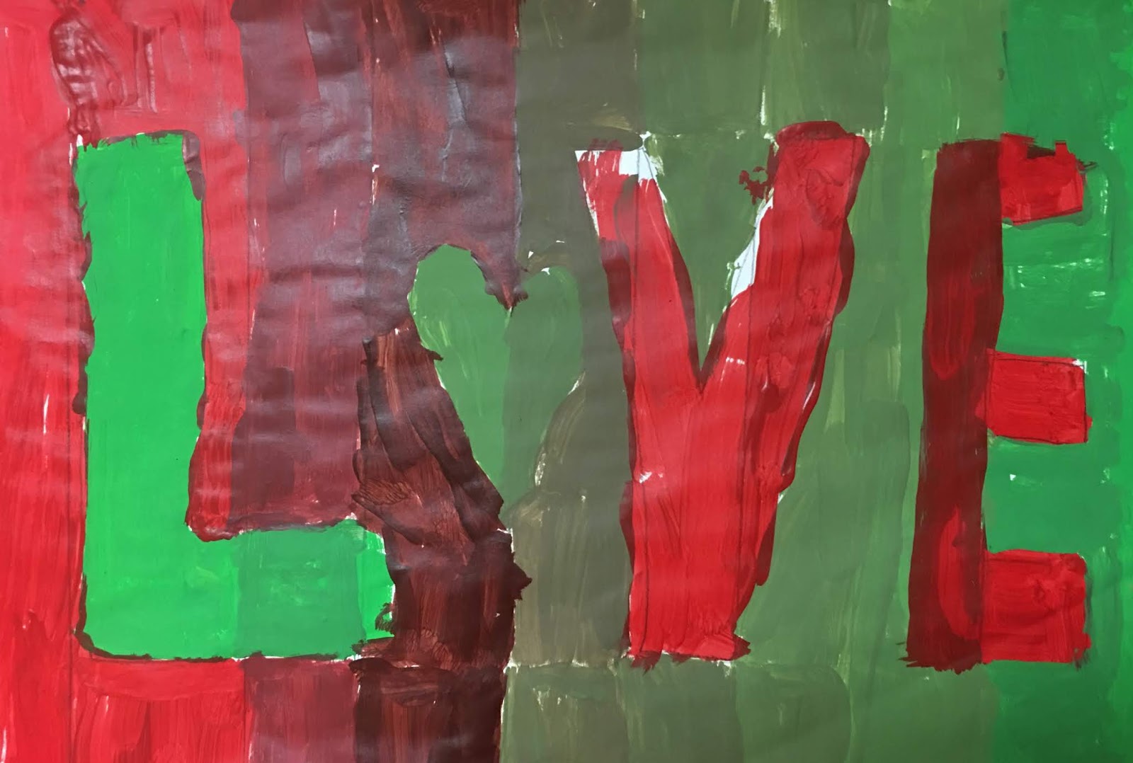
students understand saturation or intensity we made a 12"X18" scale, with shapes drawn on top. Students chose a set of complimentary colors and put the brightest of each on either end. You can't make a bright color any brighter but you can dull it or make it less intense by adding a little of its opposite. So, for example, a little red would be added to the green, and a little green to the red for the stripes next to the outer, bright stripes. and then a little more of each opposite would be added until a murky brown is in the middle. The positive shapes had the same scale going the opposite direction, so if the background went from green on the left to red on the right, then the foreground would go from red on the left to green on the right.


It is harder to mix colors in gradual, even steps, then one might think. But this sort of sensitivity to variations in intensity can only be learned through practice.

Friday, October 19, 2018

Monochromatic Masterpieces


Monochromatic means one color, which sounds pretty boring until you realize that you have almost an infinite number of values.  For this monochromatic color scheme assignment, students picked a masterpiece from art history, and a single color. Tints were made by adding that color to white, and shades were made by adding black to the color. The goal was to match the values in the original painting. The trick is recognizing that color already has value built into it. For example, it takes much less black to make red dark than it would a yellow because red is inherently darker than yellow.

When you fill a wall with a blush Botticelli, purple Turner, and green Gauguin, it stands as a testimony to the value of value.

Sunday, October 7, 2018

Color Scheme Compositions

Just because the chances of my students ever becoming high end graphic designers are slim, doesn't mean I'm going to stiff them on any of the good stuff.  Types of shapes, strong compositions, color harmonies are all part of the mix in this assignment, that I first gave teaching 2D Design at OSU a couple decades ago. 
I began by asking students to create three compositions.  One had to use only curvilinear shapes, one with only rectilinear shapes, and one had to use both curvilinear and rectilinear shapes.  Each composition had try to break up space by anchoring those shapes to the edges of the paper, and the size of shapes should vary. I wanted large, medium and small shapes in each composition.


 Then we got to color schemes.  One had to be complementary, one triadic, and one analogous. It's not too overwhelming if you take it one step at a time.  Figuring out which composition made sense for which color scheme, and arranging them latter on a 12"X18" piece of paper in a way that distributed the strong colors logically, was an important part of the process.
I hot glued about half the student compositions after they drew them (by using rulers and tracing stencils with pencils or Wiki Stix). Once a student would decide on a color scheme for a composition, and choose which color to do first, I would put little pieces of wiki stick in the shapes for that color, so that they could find the shape and paint independently.  I was thrilled when a new student told me that she loved coming to my class because at her old school they didn't know how to help blind students work as independently as possible. We're just figuring it out together, but if she's happy with the process and I'm happy with the product, then we're doing okay.

Warm and Cool Cardboard Assemblage

My self-contained classes have been learning about warm colors vs. cool colors. One week, each student painted a piece of cardboard with warm colors and the next week they did the same thing with cool colors. I strung fishing wire through the corrugations and ended up with some nice hanging collaborate art pieces to brighten the walls of the school.