Showing posts with label color harmonies. Show all posts

Friday, January 31, 2025

Analogous Watercolor Assignment


For a quick and easy color theory project, I had my students choose three neighboring colors on the color wheel to make an analogous watercolor painting. Students began by using masking/painter's tape to break up the picture plane into small, medium, and large, shapes. I like it when the strips of paint go off the edges of the paper, but smaller pieces can work too, as long as there is overlap of tape.

blind student uses fingers to navigate what parts of the paper still need painted.


blind student adding value to tape edges
Then the students wet their entire piece of paper with by brushing or spraying water on their watercolor paper. Next, they painted one color at one end, and then overlap a second color blending along the way. It could be two secondary, such as a blue at one end and red at another to make a purple in the middle, or they could use a primary in the middle like a blue with a blue-purple on one side and a green-blue on the other. 

That could be the end of the assignment, but I found everyone was able to take their painting to a next level but tracing their tape with a pencil and smudging it with their finger or gradually adding lighter value to fade it out, to create a shadow once the tape was pealed off.

By continuing to peal off one piece of tape at a time and shading around the intersections, a sense of layers and depth is created. For those with vision, they could even activate the background by creating even more layers. This was done by laying the tape done again in different positions and retracing/blending, and pealing off. What could have been a five minute exercise in mixing two or three colors to create a color harmony, now becomes an interesting composition using not only color, but line, shape, and value! That's a lot of ground being covered for a two day project.


Complementary Color Op Art Assignment

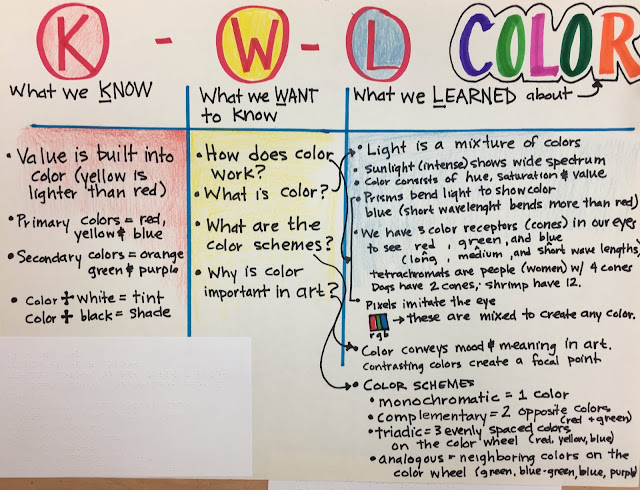
Once you have a color wheel made, you can begin to discuss the relationships and positions of colors on the wheel to form color harmonies. A complementary color scheme consists of two colors that are opposite on the color wheel. They have nothing in common, but that's OK-opposites attract! The contrast in these combos pop in a way that make them perfect for sports teams like the Florida Gators or New Orleans Saints.

yellow-orange/blue-purple compliments

I teach complements by setting three bottles primary colored paint on a table: red, yellow, and blue. These are the first and most essential colors that you need to make all of the other colors (secondary, tertiary and beyond). Two primaries make a secondary. I ask, "What do yellow and blue make?" "Green!" they answer. "And what is left over?" "Red." ":What is the opposite of green?" "Red!"  A primary color's complement is the secondary color that is a combination of the remaining primaries. So in a pair of complementary colors, you get all three primaries. The root of the word complement means "to complete." I continue to hold up a primary colored bottle of paint while students look at the remaining two colors to figure the secondary color that would make up the opposite until the concept is solidified.

Students can also look at their color wheel to find compliments other than the primaries and secondary three combos: red and green, blue and orange, yellow and purple. These tertiary colors are just shifted slightly to be a yellow-orange and blue-purple. or a blue-green and a red-orange.  When naming the tertiary colors the primary color always comes first and secondary color second. The name is the recipe for mixing. You would never have an orange-yellow, because orange can't describe a yellow. yellow is yellow. Once you mix in a little orange it is no longer yellow, it is orange.

Some students chose to work markers. Scented markers can be useful for my students who are blind. Others worked in colored pencil. Some were able to shade and highlight their shapes to make the optical illusion a little more effective. 

I outlined in hot glue the Wiki Stix drawings of students who are totally blind. Then I placed tiny pieces of Wiki Stix in every other space to make a checker board. The students could color each space without the tactile "dot" in one color, then use the complementary color to color each space with a dot, one by one, removing the dots along the way.  Student with very little vision used a VisioBook magnifier to zoom in on his shapes, which were also outlined in hot glue. It had been a dozen years since I assigned this color project, but I think the students were pretty pleased with their final pieces.


Sunday, October 7, 2018

Color Scheme Compositions

Just because the chances of my students ever becoming high end graphic designers are slim, doesn't mean I'm going to stiff them on any of the good stuff.  Types of shapes, strong compositions, color harmonies are all part of the mix in this assignment, that I first gave teaching 2D Design at OSU a couple decades ago. 
I began by asking students to create three compositions.  One had to use only curvilinear shapes, one with only rectilinear shapes, and one had to use both curvilinear and rectilinear shapes.  Each composition had try to break up space by anchoring those shapes to the edges of the paper, and the size of shapes should vary. I wanted large, medium and small shapes in each composition.


 Then we got to color schemes.  One had to be complementary, one triadic, and one analogous. It's not too overwhelming if you take it one step at a time.  Figuring out which composition made sense for which color scheme, and arranging them latter on a 12"X18" piece of paper in a way that distributed the strong colors logically, was an important part of the process.
I hot glued about half the student compositions after they drew them (by using rulers and tracing stencils with pencils or Wiki Stix). Once a student would decide on a color scheme for a composition, and choose which color to do first, I would put little pieces of wiki stick in the shapes for that color, so that they could find the shape and paint independently.  I was thrilled when a new student told me that she loved coming to my class because at her old school they didn't know how to help blind students work as independently as possible. We're just figuring it out together, but if she's happy with the process and I'm happy with the product, then we're doing okay.