Showing posts with label color theory lesson. Show all posts

Monday, February 10, 2025

Analogous Painted Box Tactile Sculpture


What can you do with an old coffee table top and a bunch of tiny boxes handed to you in a garbage bag? Make a relief sculpture for a color theory lesson of course!

For this project, students painted the boxes on one side of the color wheel, ranging from pink to green. Students mixed yellow with the pink and yellow with some blue so that most of the colors were warm and cheerful.
Students needed vision to mix the colors but didn't need any vision to feel whether or not their box was covered with paint. We all worked together to finish 135 boxes in 9 rows of 15. The coffee table had a light spray paint coverage with blacks so that some of the old scratches were covered.
Then we used masking tape to make rows and light up the squares.

It was nothing short of a miracle that the width of the tape on each age, and a tape widths between each row and column worked out to fill the space exactly.  It was a real win for the power of eye-balling and guess work. We were just guessing how many boxes we'd need. It took two people to light up the ends of the tape on either side of a box. We didn't use rulers to measure, just the width of a box.

I glued the bottoms down with hot glue and now we have a tactile sculpture that we can use to discuss things like: rectilinear shapes, crystalographic balance, analogous color schemes, and high intensity. 

Friday, February 7, 2025

Triadic Color Scheme Compositions


There are three basic classifications of color: Primary, Secondary, and Tertiary. The primary colors are three equally spaced on the color wheel. The Secondary are also equally spaced color wheel and anytime you use three equally spaced colors on the color wheel you get a TRIADIC COLOR SCHEME. 
For this quick project, students put pen to paper and use a line to create either curvilinear or rectilinear shapes. They could go back in and add some overlapping shapes. Then they picked either the primary colors or the secondary colors to make a triadic color study.

I expect my students who are blind to know the names of the primary and secondary colors and to draw their compositions, choosing what kind of shapes they want to make. I traced these drawings in hot glue so they could paint within the tactile perimeters for each color.


Tuesday, January 21, 2025

Color Wheel Lesson Plan


The color wheel is the foundation of color theory, but creating a color wheel mandala teaches so much more than primary, secondary and tertiary colors. They are also learning about social studies: culture and history of rose windows and sand mandalas. Math: division and angles. Science: how rainbows are made through refracted light and the psychology of how certain colors can evoke emotions. Art: radial balance, repetition, value, unity, and color harmonies. Careers: interior and fashion design, graphic design, photography, floral design, landscaping and wedding planning all require a basic use of how to use color effectively.

In this lesson we watched videos of Buddhist monks making Sand Mandalas with colored sand. Students learned about the concepts of impermanence and change are basic principles of some philosophies, as the monks can sweep away a masterpiece that took a hundred plus man hours to create. There may be some wisdom in not being too attached to things. We also listened to an hour long Radiolab podcast on the science of color, which included musical chords to help us hear the range of most non-color blind people see compared to butterflies or prawn shrimp. We learned about the research of genetically rare tetrachrome people. They discussed how the color blue is not in ancient literature from the Bible to the Iliad and the Odyssey. Egypt being the one exception as they actually had a pigment for blue. Then came the project.
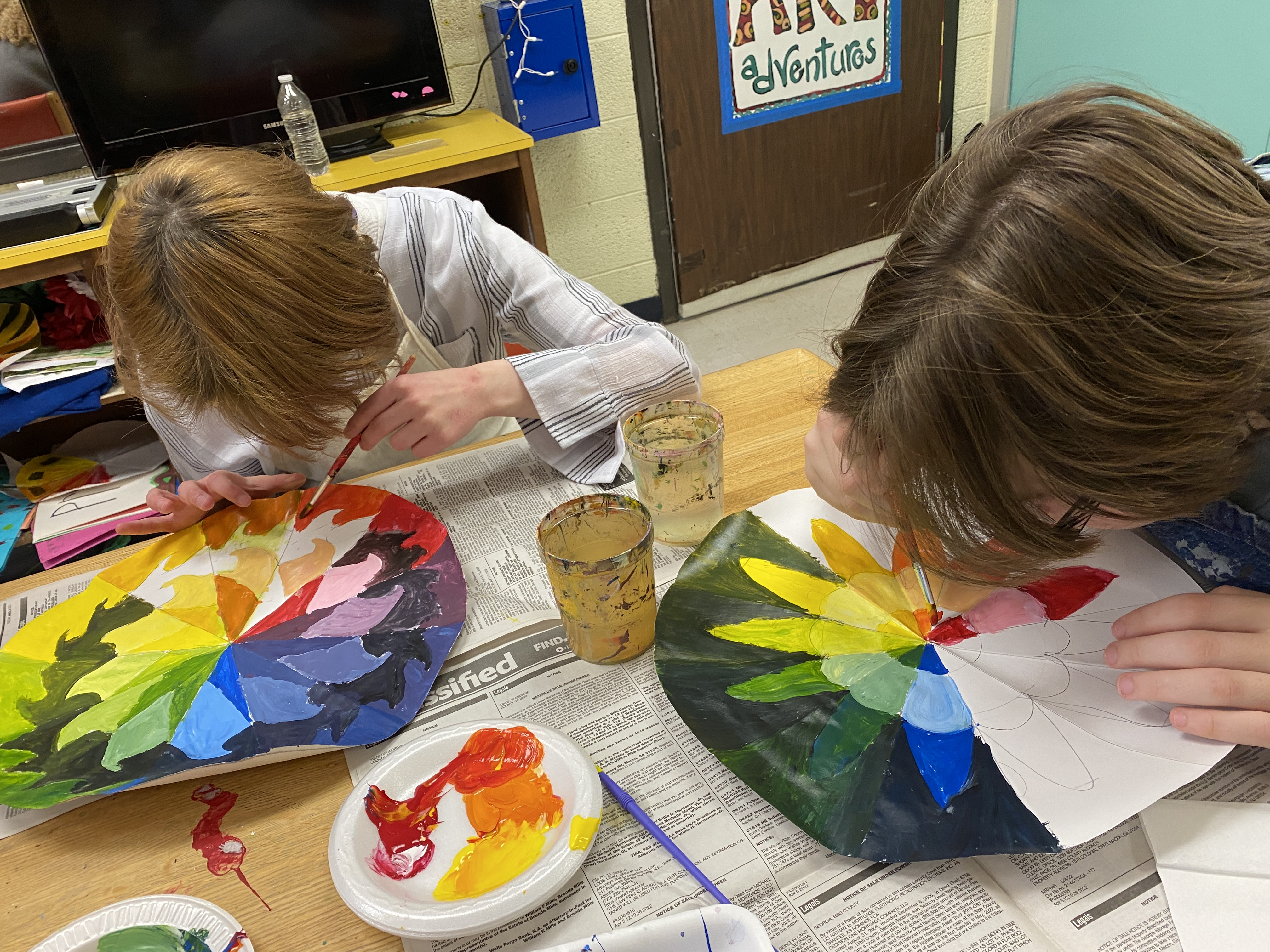
Students cut out 14 inch circles and did the math to figure out that the 12 sections would require 30 degree angles. They folded their circle into fourths and then each fourth into 3rds to get those 30 degree angles. They then used a compass and ruler to make designs. Some used a piece shaped piece of paper to create a design, which they then traced twelve times onto their wheel with the use of a light box. Students charted out where to put their primary colors of red, yellow and blue (with three spaces between each), and their secondary colors of orange, green, and purple. The six tertiary were the ones that were left, and each of their names consisted of the primary and secondary colors they were touching. The name is the recipe: yellow-green, blue-green, blue-purple, red-purple, red-orange, yellow-orange.  With a few markings students could keep track of where they wanted their lights and darks to go.

When mixing a color it is best to start with the lighter color and add a tiny bit of dark at a time until you get a mix that is visually even. If you mix equal parts of red (naturally dark color) and yellow (naturally light color) it will be a very red orange and you'll end up wasting gobs of yellow to get a middle orange color. The same works with tinting and shading colors. To make a color lighter, you tint it by adding a little of the color to white. But to make a color darker, you start with the color and shade it by adding a tiny bit of black at a time. Those dark paints are powerful.
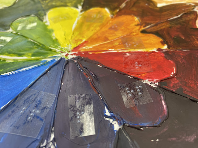
By the time the color wheel is created, they've learned how to mix paint properly to create secondary and tertiary colors from the three basic primary colors. They've also learned to tint and shade each color. Once it's completed, real discussions can be had by using the wheel as a reference. What's the complement of red? look directly across the color wheel to find the green. Want to a nice analogous color pallet? point to any four neighboring colors on the wheel. Want to see what a monochromatic color scheme might look like? Look at any little pie piece on your wheel and you'll find darks and lights of the same hue. I feel so strongly about everyone learning their colorwheel, that I teach it to my blind students. 
Braille labels with color initials help students understand upcoming lessons on color harmonies


Friday, November 11, 2022

Fauve Faces

Matisse, was lucky enough to have a mother buy him an art kit during a bout of appendicitis, which caused him to abandon his pathway to becoming a lawyer and step on the pathway to become an artist. Andy Warhol and Frida Kahlo are other famous artists whose careers were born from illness and injury. Matisse and other Fauvist painters weren't actually part of an organized movement, but more of a group of people whose style overlapped for a brief painting that allowed their strong brushstrokes and arbitrary color choices be given the name, "Fauves" meaning "Wild Beasts."

I encouraged students to work large for their Matisse style portrait assignment. They were to use the correct proportions for drawing a face as the starting point, and then try to find a way to use color in an unexpected way. Faces were divided into areas of greens, oranges, purples and yellows. Most of the time it was two main colors on the face, and then the shirt, hair and background were to use contrasting primary or secondary colors.

Students who are totally blind can still participate by drawing with Wiki Stix and choosing colors. I try to encourage all my students to use a lose brush for this assignment. Some want to create smooth, flat shapes of color, but by adding a drop of one color and a dash of another every couple brush strokes, it creates an energy and allows students to try a gestural approach. I'm happy when students try something that pushes them outside their comfort zone and introduces them to a new way of thinking...even if that way of thinking is 115 years old.


Friday, October 19, 2018

Monochromatic Masterpieces


Monochromatic means one color, which sounds pretty boring until you realize that you have almost an infinite number of values.  For this monochromatic color scheme assignment, students picked a masterpiece from art history, and a single color. Tints were made by adding that color to white, and shades were made by adding black to the color. The goal was to match the values in the original painting. The trick is recognizing that color already has value built into it. For example, it takes much less black to make red dark than it would a yellow because red is inherently darker than yellow.

When you fill a wall with a blush Botticelli, purple Turner, and green Gauguin, it stands as a testimony to the value of value.