Thursday, December 20, 2018

Screen Made Christmas Cards


The first Christmas card was published in 1843, and the tradition caught on like wildfire. People love to be remembered and it is extra special, especially in this digital age, when the card is handmade.  My students created paper stencils, for cards, by cutting out Christmas-themed drawings. We taped the stencils onto the back of a  silk screen and then squeegeed ink through the screen and onto card stock. My students have done screen printing before, but this is the first time they created an edition. They used some cards to write prisoners who volunteer their time to work as Braille transcribers, and the rest will be for sale at the student Christmas exhibit.

Thursday, December 13, 2018

Cardboard ornaments


Toddlers, pre-schoolers and multiple-complex-needs students need to make things in order to build fine motor skills and feel a sense of accomplishment. One way to keep kids and happy, busy, and learning, this month is to make ornaments. A cardboard triangle and rectangle make the tree-shaped base for this easy ornament. My students puddled and "scribbled" glue onto their shape before arranging little things onto the glue: expired pasta, fish tank pebbles, buttons, foam shapes, beads, etc. Be sure to watch that little ones don't put small items in their mouth and choke on them. 

We didn't even wait for the glue to dry completely before taking them outside and spray painting them. I hot glued ribbon for them to hang on the tree. The gold paint gives the tree a little bling, and you can pretend that the ones with askew trunks are supposed to be bells!

Thursday, December 6, 2018

paper ornaments

My first Christmas as a new bride, my husband and I had planned on spending the holiday with family in another state, but car troubles that left us stranded, broke, and in search of a tree.  We found one for $15 and I filled it with snowflakes of hardened royal icing. A couple decades later, as a teacher, I find myself still wanting to fill a tree with creativity and time rather than expensive ornaments.
For simple ball ornaments, I cut copy paper in half inch (by 8 1/2 inch) strips. These were folded to find the center and students made "a plus sign" and "a multiplication sign" to glue together in a star shape. One strip of paper was used to make a loop, and then dots of glue on the ends of the remaining strips were used to attach at the top of the loop.  These paper ball ornaments can just be used by themselves, or a couple of white balls can be glued together to make a snow man ornament.

For students who wanted to try something else with the paper strips, I had them stack 8 pieces and staple the center of the stack. (Again, folding to find the center takes almost no time). Then the end of each strip was given a drop of glue to attach to itself, to form a flower petal.


For very low functioning students, I taped a couple of fuzzy craft stems (aka pipe cleaners) to the table by the end, place the other ends in each child's hands and then say, "cross over, switch hands, pull (apart)" over and over again until it was twisted. What takes a few seconds for someone without disabilities can take a long time for a child who needs help crossing their midline.

Students managed to practice some skills and contribute to the school festivities while having fun.

Wednesday, December 5, 2018

DYI Snowflake T-shirts


I was asked to design some snowflake t-shirts for the Christmas concert at school. I thought it would be easy to use paper snowflakes as stencils on white t-shirts with blue paint, but we already had a dozen blue shirts, so I had to work backwards. I cut simple snowflake shapes (with no little holes) out of card stock an then tossed the snowflakes and kept the remaining paper. These were taped together and used as a giant stencil. By turning and shifting the stencil, each t-shirt ends up one-of-a-kind. I used the white and silver spray paint I had until the white ran out, at which point, I just used a brush and sponge to apply some white acrylic around the edges of some of the stencil shapes. The results are less than perfect, but for a one hour concert, I think it will work.

Monday, December 3, 2018

Face Pottery


Face pottery is one of the earliest forms of post-colonial art in the United States. It originated in the mid 1800's with slaves, in South Carolina, who carried their beliefs from Africa. They used face jugs the same way they had used special wooden figures, which contained special items to ward off evil spirits. These "ugly jugs" were used as grave markers to scare away the devil so the spirits of their loved ones could go to heaven. The pottery was also buried outside of doors to protect the home. Some of the jugs traveled north with escaped slaves on the Underground Railroad . I have also heard that, during the prohibition era, some used the jugs to store moonshine. (In this case the ugly faces were used to scare children away). Any archeologist and art historian will tell you that it's not just writings that tell the human story.  Much of history is told through the objects we make.
This lesson plan was fun to teach because it lent itself to so many interesting discussion questions: Why would anyone make something ugly on purpose? How do beliefs and traditions impact art? Why would anyone risk their life to escape slavery? What is the Underground Railroad and how did it work? 

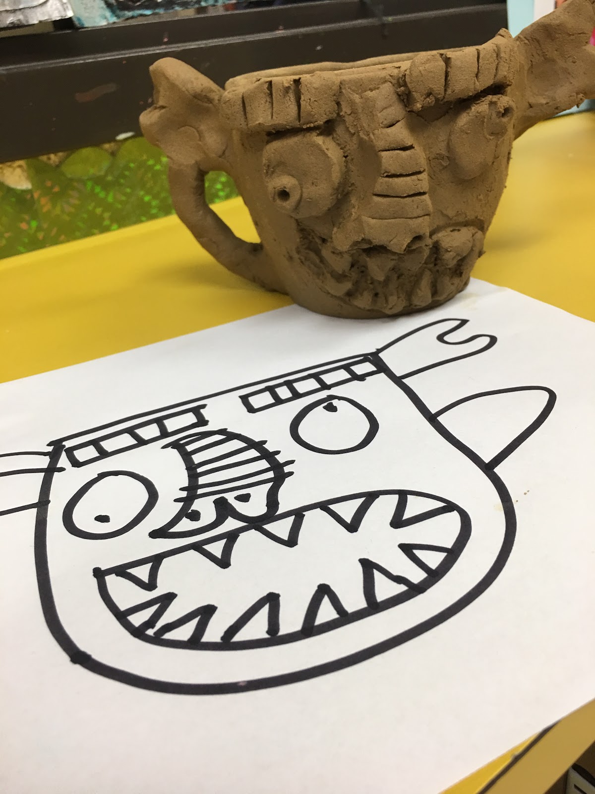
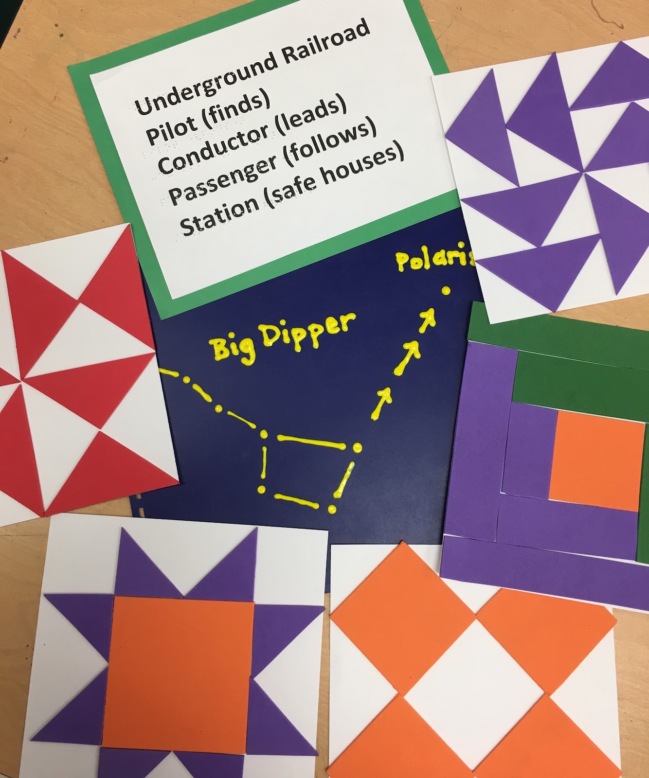
In this lesson, students learned about parts of a jug (body, neck, mouth, lip, arms). They handled a wooden mask from west Africa and talked about the expression and aesthetic of the large eyes and open mouth. They learned the history of the underground railroad which began just as railroads started to be built in the U.S. and lasted the 30 years leading up to the Civil War (1830-1860). Students studied tactile freedom quilt squares and guessed the symbolism used to communicate to runaway slaves (North Star, log cabin, crossroads, bow tie, geese). They saw and felt a diagram of the Big Dipper and North Star, and learned how constellations helped lead people even without maps.
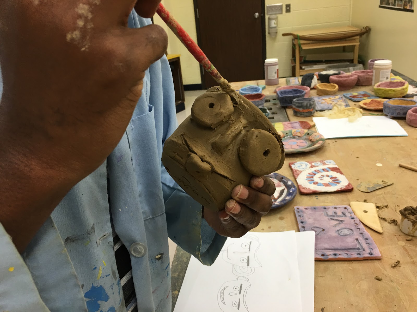
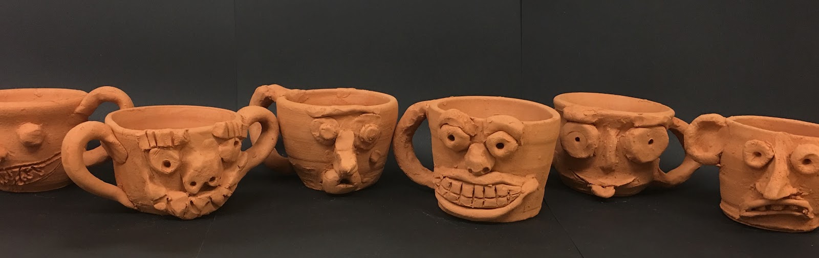
For the production part of the lesson, students were required to draw at least three sketches of ugly, crazy, or goofy faces. I showed them how to use the pottery wheel and helped them throw their first cup. They used the slip and score technique to attache a handle and face to their leather hard cup.

Then we did a bisque fire.


And glazed the mugs.

Opening the kiln to see all the crazy colors and expressions was so exciting! I've only done this assignment once before, years ago, but to me it is a great way to teach contextual understanding of an art as well as ceramic skills and techniques. It is also the perfect assignment to let students feel less afraid about making mistakes, because when your goal is to make something ugly, the bigger mistake the better. And there's beauty in that.
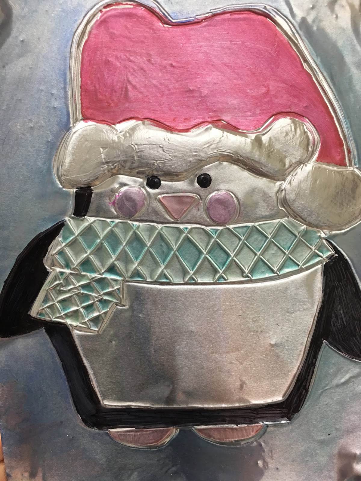


Wednesday, November 28, 2018

Caulk and Cardboard

Our month long unit on low-relief sculpture included exposing the corrugation on spray painted cardboard, carving clay slabs, tooling foil, and casting plaster. I handed caulk guns to students who finished projects a day or two early, and they made images on cardboard. The caulk needs a couple of hours to dry before painting. They may not look amazing, but for students with no sight, it is how it feels that matters the most.

Saturday, November 17, 2018

Casting Plaster

Plaster casting is not as hard as I thought it would be and it was a perfect tactile project for my students with low to no vision. I took them on a walk around campus to pick out leaves and berries that they might want to cast. Some chose to use tools and stamps to create texture into their slab of clay however. Once we pressed and rolled shapes and lines into the clay, we placed it in a pie tin, as though it were a crust. 

 The powder Plaster of Paris is added to water in a one to two ratio.  It gets thicker with time, so we worked pretty quickly and made sure it was about the consistency of a runny pancake batter.  I thought if it was really thick it would be stronger, but it made it crumbly and hard to manage.


Once it was poured into the "pie crust" I took a wire and bent it to make a hanging loop. This will make it easier to hang from the wall, so it is important that the loop is at the top.

After an hour or two it was set. We flipped it up side down and pealed the clay away from the plaster. Of course red Georgia clay is not the first choice for this project since it is hard to get the dirty look from the pristine clay, but we worked with what we had, and once it is painted it won't show. This project can be used for a child's hand print, rubber stamp lettered words or ways of preserving nature. It was also a perfect way for us to create relief sculpture using a new medium and technique.


Wednesday, November 14, 2018

Embossing Foil

A flying pig embossed in foil


Repousse is a metal working technique in which thin metal or heavy foil is hammered or embossed on the back to make it stand out in the front. My students totally understand the idea of embossing as they use braillers to emboss paper all the time. They used plastic pencil-shaped tools to "tool" the foil and create a wide array of images as part of a low-relief sculpture unit.  Some students painted their images with black acrylic and then wiped it away to give it an aged, batik feel, some colored their image with markers and then gently wiped it away for a stained look, some did both. There's nothing quite like hearing kids who have never had vision, feel their artwork and say, "This looks great!"

Carving Clay Slabs


Introducing students to relief sculpture is easy when you have a bunch of clay, a slab roller, and some carving tools.  It was just a matter of having them come up with ideas, and decided how much to take away. Carving is a subtractive process and future ceramic projects will be an additive process, so there is yin and yang in my curriculum throughout the school year.  Each student did some sketches. Rolled a slab, cut out the shape, and by the next day it was leather hard and ready to carve.


Once the pieces were fired and glazed, ribbons were tied through pre-made holes so that they could be hung on the wall. We had some trouble with our first glaze since the kiln didn't get hot enough.

Saturday, November 10, 2018

October Fun! Field Trips and Disaster Relief!

Happy birthday APH! My student took the picture, in Kentucky.
Indian Mound field trip in Georgia
The American Printing House for the Blind was set up by the federal government to make the education of U.S. citizens, who are blind and visually impaired, possible. One hundred and sixty years later, they are still making learning materials accessible.  Each year, I submit student work to APH Insights Art contest, and in the past four years we have had 6 students win awards and 12 others get into the juried exhibition. Even some of the pieces that don't get into the show sell. Last year alone we had 15 pieces sell, which is always a thrill for our students. This year, one of my winning students sold her piece to the vice principal of the Idaho School for the Blind, so it will be hanging there, the opposite corner of the country from us. It is a long ride to get to Kentucky for the awards ceremony and exhibition, that accompanies the annual conference, but it is a thrill for my students to be recognized on a national stage and to get to tour the printing house and museum.

I worked a second weekend in October by helping with a Short Course at the school. Our students went to the Ocmulgee Indian Mounds National Monument; I taught them how to make coil pots and led a drum circle.


From the student paper


I was supposed to present at a state wide training for teachers of students who are visually impaired, but Hurricane Micheal came and shut down the conference along with my power. I ended up spending a weekend in the Tallahassee area with my family and some friends, helping get trees off of people's houses. Between cross country meets for my kids and helping my son get college applications together while simultaneously filling out a mountain of paper work that comes with being named my school's Teacher of the Year (yippee!) I've been pretty busy. I also managed to help sub for 6:10am class several times each week.

My hubby with his amazing Art Department colleagues

And then there was getting my daughter to the state fair, attending artist's talks as well as Wesleyan College's presidential inauguration, volunteering at the children's home fundraising dinner, and my school's Halloween dance. (Breath.) Tell me how teachers don't have to work late nights and weekends again? But seriously, I hope to catch a break now that October is over...maybe after Christmas.

Saturday, November 3, 2018

Cut-away Cardboard


For a fun and easy tactile project, students researched high contrast images online of the subject of their choice. Then they printed out a favorite, and cut away the darkest or the lightest areas. What remained was a spray paint stencil. If the light areas were removed, white spray paint on cardboard would replace those areas via the stencil. Some of the darkest areas, or just the back ground shapes, were outlined with an X-Acto knife and then the top layer of cardboard was peeled away, revealing the corrugation.

Some images were done by painting book board, and gluing parts of magazine pages onto the board before reusing the spray paint stencil. This wasn't as tactile, but still made for some interesting visual effects.


Monday, October 29, 2018

Saturation Scale Assignment


 Color has three components: hue (is it blue? red? green?), value (is it light or dark?), and saturation (is it bright or muted?). To help students understand saturation or intensity we made a 12"X18" scale, with shapes drawn on top. Students chose a set of complimentary colors and put the brightest of each on either end. You can't make a bright color any brighter but you can dull it or make it less intense by adding a little of its opposite. So, for example, a little red would be added to the green, and a little green to the red for the stripes next to the outer, bright stripes. and then a little more of each opposite would be added until a murky brown is in the middle. The positive shapes had the same scale going the opposite direction, so if the background went from green on the left to red on the right, then the foreground would go from red on the left to green on the right.


It is harder to mix colors in gradual, even steps, then one might think. But this sort of sensitivity to variations in intensity can only be learned through practice.

Friday, October 19, 2018

Monochromatic Masterpieces


Monochromatic means one color, which sounds pretty boring until you realize that you have almost an infinite number of values.  For this monochromatic color scheme assignment, students picked a masterpiece from art history, and a single color. Tints were made by adding that color to white, and shades were made by adding black to the color. The goal was to match the values in the original painting. The trick is recognizing that color already has value built into it. For example, it takes much less black to make red dark than it would a yellow because red is inherently darker than yellow.

When you fill a wall with a blush Botticelli, purple Turner, and green Gauguin, it stands as a testimony to the value of value.

Sunday, October 7, 2018

Color Scheme Compositions

Just because the chances of my students ever becoming high end graphic designers are slim, doesn't mean I'm going to stiff them on any of the good stuff.  Types of shapes, strong compositions, color harmonies are all part of the mix in this assignment, that I first gave teaching 2D Design at OSU a couple decades ago. 
I began by asking students to create three compositions.  One had to use only curvilinear shapes, one with only rectilinear shapes, and one had to use both curvilinear and rectilinear shapes.  Each composition had try to break up space by anchoring those shapes to the edges of the paper, and the size of shapes should vary. I wanted large, medium and small shapes in each composition.


 Then we got to color schemes.  One had to be complementary, one triadic, and one analogous. It's not too overwhelming if you take it one step at a time.  Figuring out which composition made sense for which color scheme, and arranging them latter on a 12"X18" piece of paper in a way that distributed the strong colors logically, was an important part of the process.
I hot glued about half the student compositions after they drew them (by using rulers and tracing stencils with pencils or Wiki Stix). Once a student would decide on a color scheme for a composition, and choose which color to do first, I would put little pieces of wiki stick in the shapes for that color, so that they could find the shape and paint independently.  I was thrilled when a new student told me that she loved coming to my class because at her old school they didn't know how to help blind students work as independently as possible. We're just figuring it out together, but if she's happy with the process and I'm happy with the product, then we're doing okay.