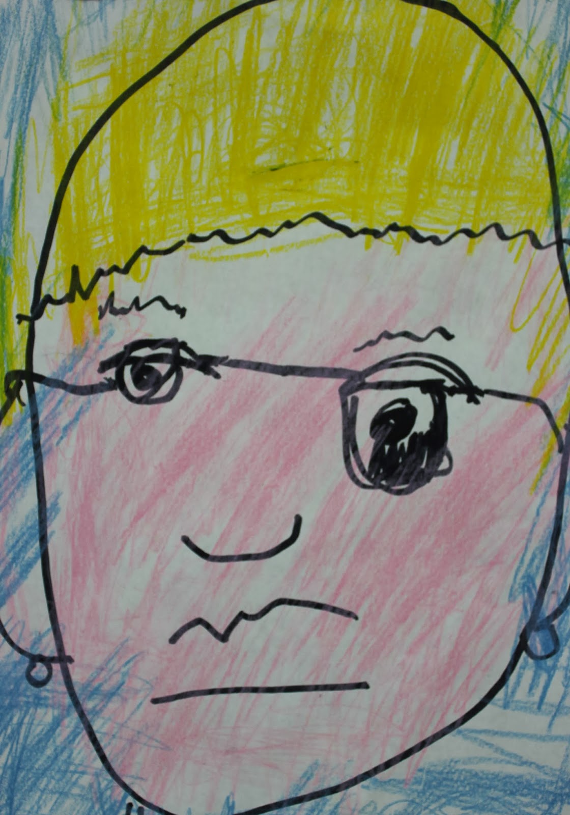
"Elements of Art" or "Elements of Design" are the basic building blocks of images; they are: line, shape, color value, texture, form and space. Without them there can be no drawing, painting or sculpture. Form is basically the 3D version of a shape. The illusion of space requires one of the other elements to create it; linear perspective and cross contour uses lines, atmospheric perspective uses value. Shapes can overlap or be used to show relative size (small shapes look like they are further away). An orange shape on a blue background shows how color creates a sense of space because cool colors recede.

My first assignment for the year, is having students create a chart illustrating each of the elements of art. I don't require students to include "space" on their "elements of art" chart, for the reason that it is a repeat of the other elements. The same can be said of "form" unless they want to actually glue 3D objects to their chart. The chart can be created by dividing a piece of paper or poster board into five or six sections, one for each element: line, shape, color, value, and texture are required. Again, form is optional. paper.
Another option for this project is to make a book to illustrate elements. To make this, use a 12" X 18" piece of paper cut in half to make two strips of 6" X 18" pieces. Each piece is folded in half, and the end ends folded back on themselves to form a W, of four 6"X4" sections or pages. The two "W" sheets are then glued along the back of one of the ends and aligned with the edge of the other strip so that the 2 W's make a 24 long strip of folded paper. That way, each element can have it's own page.

Use a glue stick to glue the back of the last page (the whole page to the edges). It helps to have a piece of scrap paper under that on the back of the last page to keep glue off the rest of the book during application. Center the stacked book pages on the back of a piece of mat board or cardboard/chip board wrapped in colored paper, and rub until the glue side of the page is smooth. Repeat the same process to glue the other end of the strips of paper to the other board, making sure that the boards line up as well as possible. Viola! You've made an accordion book! You can add a title or image to glue to the front of your book. If you'd like a spine you can use colored tape or glue a strip of colored paper; this will require viewers to flip through the pages and prohibits them from stretching out out, but it may feel more like a book to you. 

For a stronger finished product try to think of how one page or part of the chart can seamlessly align with the next part. Make the color extra colorful. Make the lines extra linear, whether they be straight, zig zag, or loopy. You want good clean examples of each element. Shapes can be geometric or organic, curvilinear or rectilinear. Think in terms of composition, maybe breaking up the space into large, medium and small shapes. Feel free to use negative shapes within your positive shapes. Value can be built through stippling (dots) or cross hatching. Charcoal or graphite can also be used to show a range of lights and darks. Textures can be flat illusions of texture or actual pieces of lace, sand paper, etc glued to the page. Don't forget to label each element.

 Each card can be Brailled at the top center so it can be read before pulling the card out of the envelop. Separate strips of braille can also be glued later so that each element has a label.
 Wiki Stix, glued yarn or ribbon, puffy paint, or Elmer's glue can create a variety of tactile lines. Foam or cardboard shapes can be glued. Glued Sand, crumpled foil, or feathers can be used for the texture. Value can be made by stippling little dots of puffy paint. Be creative and try to make the book original, while maintaining clarity in how you illustrate and understanding of the Elements of Art.


For a stronger finished product try to think of how one page or part of the chart can seamlessly align with the next part. Make the color extra colorful. Make the lines extra linear, whether they be straight, zig zag, or loopy. You want good clean examples of each element. Shapes can be geometric or organic, curvilinear or rectilinear. Think in terms of composition, maybe breaking up the space into large, medium and small shapes. Feel free to use negative shapes within your positive shapes. Value can be built through stippling (dots) or cross hatching. Charcoal or graphite can also be used to show a range of lights and darks. Textures can be flat illusions of texture or actual pieces of lace, sand paper, etc glued to the page. Don't forget to label each element.
Another option is an envelop book. this might be a good option for my students who are totally blind.

To make this, glue the opened flap of one envelop onto the bottom back of another envelop. Create a chain, of at least five envelops so that each one can represent an Element of Art.