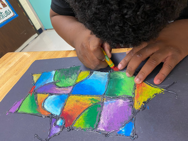
The concept of balance gets more complicated when you try to balance color and shape throughout a composition. The goal is to lead the viewer's eye throughout the piece, placing blues and oranges in ways the form triangles and take value and shape into account as you create some visual stability.
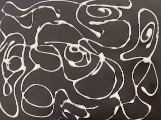
This is especially complicated when you don't have any vision. My students, who are visually impaired or blind began their assignment by setting a squirt of school glue in motion to create a meandering line that crossed over itself to make shapes. The glue created boundaries for oil pastel, but Elmer's isn't a tall enough wall for some of my students, So I would trace over the Elmer's with Wiki-Stix for my students to feel their shapes. Or they would start their drawings with Wiki-Stix and I'd trace them in hot glue before removing the Wiki Stix.
 |
| Wiki Stix create boundaries on one or two shapes at a time. |
Students would choose where to place each color and then vary the value within the shape, which made it a more interesting than flat shapes. Oil Pastels are easy to use and after coloring for a short amount of time it is easy to feel the difference between plain paper and the greasy patch of color. I was so pleased with how the assignments turned out, proving that you don't need to know how to draw to make a pretty picture, and you don't need to see to make a solid composition.


