 One of my art professors told me, "If you can't make it good, make it big." Scale gives some legitimacy to art. Claus Oldenburg's spoon with a cherry, would be far less impressive if it were life size. It's the making it bigger than life that makes it spectacular. Adding a fountain element to the cherry stem is the over-the-top silliness that sells it to even anti-Pop Art grumps. I decided to give my students a larger-than-life self-portrait assignment, and ended up with some really happy results.
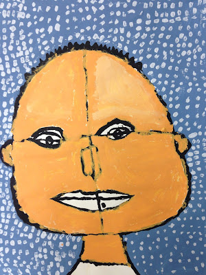
I teach proportions by having students draw a line of symmetry, and find the vertical placement of the eyes on that line. One student kept those preliminary lines, and I love it. This portrait (left) reminds me of Paul Klee.
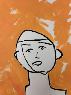
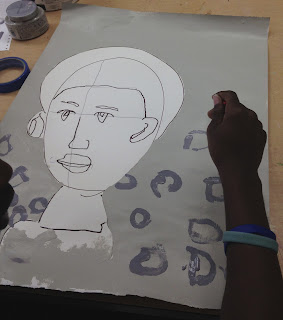
Because the student, whose paintings are below, has no vision, I would move his hand in the shape the head, four or five times before giving him a brush and having him do it independently, based on muscle memory. Or I would hold his hand over a painted eye and say, the eyebrow goes here, and he'd paint it. I loved these so much that I had him do the assignment four times! Each time, I cut a construction paper head and neck to match his shape, and tape it to his painting, so he could paint the background without any worries of covering the figure.

The student, whose work is shown below was so excited about his image that he decided that he and I should publish a picture book of just this one image. "We'll be rich!" he insisted. He just started art this semester. Fingers crossed that the enthusiasm lasts.

 This portrait was done by a cognitively impaired student who is completely blind. I positioned the his hand and told him what part of the face belonged at that spot. I traced the marker lines with hot glue for watercolor boundaries (the acrylic would have covered the lines). Then I covered the portrait and the student used a stencil and colored pencil to add pattern to the background. It feels simultaneously ephemeral and playful to me.
My advanced students could choose their own medium. This one chose to work in pencil,
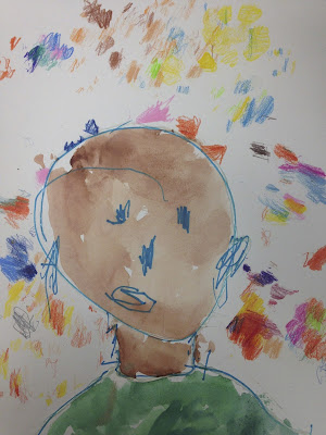
and this one used marker and pastel.
When I look back on an assignment, I can tell if it's a good one or not by how broad the range is in terms of style and interpretation. Everyone definitely was able to show off their skills and reveal their unique style and preferences. Plus they were forced to be bold, by working large. I'll be using this lesson again in the future.


I think this is one of my favorite posts on your blog so far. So amazing.
ReplyDelete