Math becomes meaningful for art lovers, during tessellation projects.

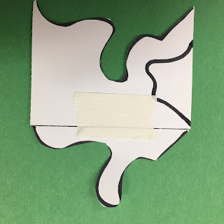
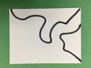
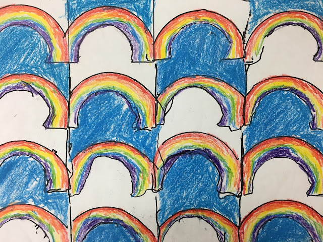
 I introduce my students to tessellation project by showing them images of E.C. Escher's amazing work and letting them handle a pop up book of his pieces. How is it done? They want to know. How does he make black geese fly one direction and white geese fly the other? How are tessellations made. I tell my students I will show them if they can try to figure out how to change the perimeter of a card without changing the area. We do the math together to find the perimeter and area of a football field or an iphone. I hand them a card: 3"X5" or 3"X3" or 3"X2". They figure out the perimeter and diameter of their card themselves. Then I show them how I can draw a line that starts on one side and ends on the same side. I cut along the line and then slide the card to the opposite side and tape it to the edge. (This works well with graph paper, for students of vision). Did I change the area? No. I didn't throw any part away, and I didn't add any piece from a different card. Did I change the perimeter? Well if the shortest distance between two lines is a straight line and my line is now curvy or zig zag to get from one point to another, than I increased the distance, so yes. I like to encourage my students draw and cut from corner to corner so that students can easily line the edge up to the opposite side without needing to grid card to line it up. The rainbow tessellation at the top is an example of what it looks like with only one shape cut. If you want something less boxy, you can cut a second shape from another straight side before sliding and taping it to it's opposite side. Now you have a template.

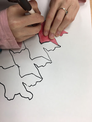
The template can be placed anywhere on a piece of paper (we use 12"X18") and traced, and then slid (not flipped, not turned, but slid) so that the right side of the template fits into the left side of the drawn shape. This repeated pattern fills the page. Some of my visually impaired students use devices to see the edges better, but my blind students had to trace their template using wiki sticks which later served as tactile barriers for coloring with markers. A few students traced with a 20/20 pen and then I went over their lines with hot glue so they could feel their edges.
This is a piece done by a co-worker as I walked her through the process. The element of design we focus on is shape, and the focus principles of design are repetition/pattern and balance (crystallographic). The project is rich enough that there many ways to teach it, and that's important to someone like me, who never wants to live a boring day.


No comments:
Post a Comment