 Then we got to color schemes. One had to be complementary,
one triadic, and one analogous. It's not too overwhelming if you take it
one step at a time. Figuring out which composition made sense for
which color scheme, and arranging them latter on a 12"X18" piece of
paper in a way that distributed the strong colors logically, was an
important part of the process.
Then we got to color schemes. One had to be complementary,
one triadic, and one analogous. It's not too overwhelming if you take it
one step at a time. Figuring out which composition made sense for
which color scheme, and arranging them latter on a 12"X18" piece of
paper in a way that distributed the strong colors logically, was an
important part of the process.Sunday, October 7, 2018
Color Scheme Compositions
Just because the chances of my students ever becoming high end
graphic designers are slim, doesn't mean I'm going to stiff them on any of the
good stuff. Types of shapes, strong compositions, color harmonies are
all part of the mix in this assignment, that I first gave teaching 2D Design at OSU a couple decades ago.
I began by asking students to
create three compositions. One had to use only curvilinear shapes, one
with only rectilinear shapes, and one had to use both curvilinear and
rectilinear shapes. Each composition had try to break up space by
anchoring those shapes to the edges of the paper, and the size of shapes
should vary. I wanted large, medium and small shapes in each
composition.
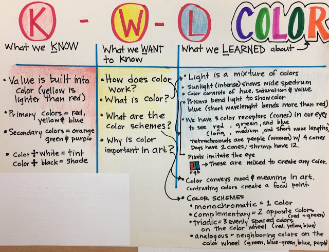
 Then we got to color schemes. One had to be complementary,
one triadic, and one analogous. It's not too overwhelming if you take it
one step at a time. Figuring out which composition made sense for
which color scheme, and arranging them latter on a 12"X18" piece of
paper in a way that distributed the strong colors logically, was an
important part of the process.
I hot glued about half the student compositions after they drew them (by
using rulers and tracing stencils with pencils or Wiki Stix). Once a
student would decide on a color scheme for a composition, and choose
which color to do first, I would put little pieces of wiki stick in the
shapes for that color, so that they could find the shape and paint
independently. I was thrilled when a new student told me that she loved
coming to my class because at her old school they didn't know how to
help blind students work as independently as possible. We're just
figuring it out together, but if she's happy with the process and I'm
happy with the product, then we're doing okay.
 Then we got to color schemes. One had to be complementary,
one triadic, and one analogous. It's not too overwhelming if you take it
one step at a time. Figuring out which composition made sense for
which color scheme, and arranging them latter on a 12"X18" piece of
paper in a way that distributed the strong colors logically, was an
important part of the process.
Subscribe to:
Post Comments (Atom)


No comments:
Post a Comment